This tour was recorded by Manawatū People’s Radio; full audio can be found in their programme archive. Selected video highlights are also available.
You’ve got two paintings here with different titles, but they have a link, is that right?
It’s a Japanese theme. A lot of times I work from an autobiographical stance. These are my visual letters to my daughter-in-law – who is Japanese – explaining how naïve and ignorant I am of Japanese culture. They’re tongue in cheek and quite whimsical, but we have a lot of references to things that only a Western boy, without any background in Eastern culture, would assume to be part of that.
Technique-wise, I use a lot of watercolour, and gouache and ink and just about anything I can throw at these things. I use a lot of text and cut-out collage elements. This is an old napkin that was from a Gilbert and Sullivan play, that I photocopied and manipulated and photocopied again and glued on there, so there’s a lot of gluing and a lot of traditional painting involved with it. It’s quite a mixture. The text reinforces what I’m trying to get to. Some [themes] are universal; some are just references as a bit of a giggle to me. “No Eat” is a reference to a passage in a Maurice Sendak children’s book where someone’s being scolded for eating too much. I guess that would have to do with staying away from too many noodles
Both the paintings have photographs of Japanese soldiers and airmen; you mentioned a sort of fascination with them?
Again, it’s an easy reference – a kind of lazy man’s reference – to an aspect of Japanese culture. I was fascinated by looking at some of these old photographs of the Japanese soldiers and pilots during WW2. I co-joined that with a concept of “the last haiku poets”, so I was interplaying that a little bit, and taking the fact that we don’t know these people’s identity; they just become faces in a photograph. I’m just trying to relate the concept of the anonymity of these people with the anonymity of the poetry. Again, I’ll go in there and embellish it with paint and change it around a little bit if I can. So a lot of that stuff is manipulated in different ways, whether it’s through collage or through overpainting.
Where do you find the photos and other collage elements?
I get them right off the internet, then I either blow them up or shrink them down or whatever takes my fancy. We’ll see later on a real beating up of the image, then photocopying that and putting it into the picture
[We move on to the southeast wall]
These are a lot simpler than your other works.
Simpler and smaller. There’s not so much a theme that relates to all four of them, but the top ones are stylised, there’s not so much information, except perhaps this one down on the lower right. There’s this idea of getting even with people. Putting the target out there and then shooting it up and getting rid of aggression, and of course with my shooting I’ve missed the target completely and shot up the wall quite severely. Cowboys Don’t Cry is a little bit of a letter to the human condition. Cowboys do cry when their hearts are broken. We have the motif of the red rose and the spur that’s the broken heart and the Old Western text that goes on there as well
Contrasted with the much more modern typeface of the question boxes.
Yes, and the True/False thing you can tick. If you were to buy that, you could make your own change. I have all sorts of things that I use, say for instance I will make a smudge on it and then say “lick here”, so there’s all these different ideas of what I’m feeling, what I’m trying to say. The picture is also anything I can get away with.
Bone of Contention is very stripped down – literally.
This came to me when trying to solve puzzles that Man has always fought with, and I thought that maybe I could be the one to actually show “the bone of contention”. I made up that bone – there’s a little bit of pelvic bone in there but a lot of it is just imagination. I centralised the bone and put in a blue background, because the blue drops back and allows the hint of the sepia in the bone to come forward. The bone of contention has been finally visualised.
I Could Have Danced All Night is a composite – very cluttered – of a night out on the town in Hollywood in LA. You’ve got the five dollar pistol with the strapping on the handle, the ubiquitous burrito. Down here I’ve incorporated a Muscle Beach Café receipt for two coffees. There’s a Hollywood image in the back – I originally used a postcard I got when I was in Hollywood. I blew that up, cut it up, repainted it, manipulated the heck out of it, cut it up again and re-placed it. It’s hard to believe but that was a small postcard at one time. Then we have these two shoes representing dancing all night – and both of them have gum on the bottom. It’s kind of a tacky affair, the idea of dancing all night with this sort of cheap and tawdry two dollar coffee, and a cheeseburger
There’s a contrast between the glamour of the Hollywood image and the grime of the reality.
Yeah. It’s the seedier side of romance. This isn’t anything that Brad Pitt would be in. Or maybe he would!
There’s more of an American influence in these images.
That influence can’t be denied – I was born and bred in the States – but I’ve lived in New Zealand a lot longer than I’ve ever lived in the States. I’m a New Zealander and this is my home. This is the idea of shore leave and all the trouble one can get into as a sailor. Again, just a little interplay with a little humour. I’ve got fish’n’chips, and the old Players cigarettes brought together with a Brew 102 draught. When I was growing up in southern California, you could buy a six pack of that for a dollar and two cents. It was a very green beer and it gave you an incredible headache. They haven’t made it in thirty years. This is a postcard I took from the internet, painted it up. It’s from the New Pike, which used to be a rollercoaster in Long Beach, California. “Pleasure the Harbour” is a song from folk-singer Phil Ochs about a sailor on leave. Here there’s a reference to the sea and the hot-dog that the sailor would have had. These were just fun attempts at painting pieces of paper – they’re painted, they’re not stuck on – and then I list examples of the colour that was used to create the crab and the hotdog. It’s silly academic reference to painting.
There are a lot of elements here; did you have a larger list and have to cut it down? Or did you just add bits until it felt done?
No, they just come to me. I don’t work with sketchbooks. I don’t really have any preconceived thought of what the painting is gonna be until I start working with it. This one would have been central: I painted a crab because I would have been interested in painting a crab that day. So there are lots of references to everything.
The painting has a lot of rewards for someone who was alive at the end of the war.
I hope so! That’s the whole concept of what a lot of the paintings are about. There’s a universal thing we all share, a consciousness, about life, love, death, hate, politics, all that stuff. What I try to do is present a story that has elements in it that are personal to me, but they’re also personal, or identifiable, to everybody. Then with a good shot of humour and fool-the-eye use of collage and realistic painting, back and forth, creating not a picture of something but a composite picture of an idea, rather than a landscape or a traditional still life. It becomes a picture in its own right, that can’t be classified.
While we have objects on a plane in this one, it would hardly be considered a still life, because it breaks up into different areas that contain different information, or I pull in one area and force it to make comment on another one. Again, this is Southern California in a way, but I guess any sort of beach guy that’s lived there too long – a 50- or 60-year-old guy who’s still living above the garage so he can surf in the morning. He’s got all these references of reclaiming the past, in the ‘60s and ‘70s, which would have been my time of growing up. We’ve got the breakfast burrito, we’ve got Eugene McCarthy who was a peace candidate for president in the US in ’68, we’ve got The Grateful Dead, references to Tim Leary, Allen Ginsberg and drug culture. A lot of this stuff then was painted with watercolour, and with my fascination for using collage and text, I’d have taken that poster, crumpled it up several times, re-photocopied it, then turned it upside down and just thrown water on it. So we’d get these stains on it, which would reference splashes from the sea.
This here, Still Life with Cheeseburger, I wanted to get a cheeseburger wrapper and fold it up and paint a cheeseburger, and use the collage element in association with it. I had the germination of what I wanted to do, and then the rest of the picture just developed. This one developed into “vanitas”, which is a theme from back in the Renaissance and even before, about the temporal quality of pleasure. It’s a very deep and pious kind of idea that doesn’t go well with the overall humour and frivolity that I use on this. So we have some of the “vanities” that are temporal and will not last, like music, so there’s an old ukulele that’s broken; there’s food; music again with the tin horn; relationships with people that I used to know; old 1920s photographs I found of naughty French postcards.
And of course the butterfly is the very essence of being short-lived.
Yes, that’s for sure. And then there are always bones and skulls referenced in these old vanitas paintings. I was fascinated with bones and birds especially, so I thought it gave me a wonderful opportunity to do some studies of the bird.
Tell me about the can of beans. That was an interesting technique.
I took a tin, and after I’d consumed what was in it, I cut the bean tin, folded it out, beat it up a little bit with a hammer then photocopied that. Then I cut it out to fit that shape, photocopied an Old El Paso bean can, tore that up and then stuck it back on there. The pencils I used would have stopped about here, and I’d have glued all that section on top of it. So there’s this play that goes on. They’re not really pictures of pictures – landscapes or anything like that. They’re narratives, stories about something. Sometimes you get them, and sometimes you think “jeez, there’s stuff in there that I’m getting but it’s just a little vacant”. So it’s this play of being almost totally understandable to the point where it’s just kind of a dream-state, where we get the essence of things. And again, how serious does art have to be? I use fun, because my life is fun, and I like to push that into my work as well.
In this one, For the Time-Challenged Executive, these are ways I thought we could speed up breakfast so we could get that out of the way and get to our offices and keep the economy going. We have everything from spray-cans of baked bean essence to pre-fried eggs in a sandwich bag, pre-cut pieces of bacon, a tomato sauce patch. You could save a lot of time if you had pre-sweetened bristles on your toothbrush with coffee-tasting toothpaste.
This is a brainstorm, isn’t it? You could have made half a dozen of these.
Oh yeah! A lot of these things give rise to “lunch for the time-challenged executive”, “dinner for the time-challenged executive”, “relationships for the time-challenged executive”. Once you start on this thing you can go forever.
These two on the side here, Still Life Descending and Newton’s Apple, are small paintings about my own concepts of gravity – having never studied it, scientifically. So I have a still life descending to a table; there’s nothing holding it there. The whole picture is being brought down, background and all. This is a simple, very idiotic attempt to explain gravity – a still life with a big thick directional arrow for the apple which has fallen down and is now on the floor. Again, I painted the apple then took one of the little stickers from the apple and just stuck it on there.
[We move on to the southwest wall]
This little grouping of three here is taking a theme of socialism and just having a bit of fun with politics. The first one is The Autumn of Leon Trotsky which features, again, this composite, this “pieces of the puzzle” that shows his last days in Mexico. It has all the historic references – the little hand-held axe that the assassin stuck in his forehead; references to Mexico: down here we have a little area of Frida Kahlo, who had an affair with Trotsky; tequila; a switchblade; a reefer – an American marijuana cigarette. We have up here these drips that represent blood, a tear, and taco sauce. Lots of collage work.
A humorous depiction of Stalin, there, orchestrating the whole thing.
Yes. He appears in Multiple Trotskys as well. These little references to Stalin I sourced from the internet, cut them out, blew them up, shrunk them down, and created my own little picture of it. So we have Stalin behind him with a pin writing “adios” on Trotsky’s pillow, as he’s pulling up the bandage on his head to reveal where his henchman had punctured his head. And then behind, the mariachi band of skeletons. Multiple Trotskys is the same, we have these Trotskys in reversed images, and Stalin again, behind him. Tall Poppy Syndrome is stylised from garden clippers to a watercolour brush to a small hammer, an arrangement that resembles the hammer and sickle. It’s a very subliminal kind of feeling. Those are little star stickers that I bought. Sometimes I’ll stick them on and paint over them, then pull them off so they’re in the negative. The tall poppy itself – again, I sourced a photograph, photocopied it, reversed it on the paper and watered it so the ink started dripping out. So we get these drips that imply the poppy but don’t show the leaves or anything. Then I photocopied that, glued it on and painted the centrepiece of it.

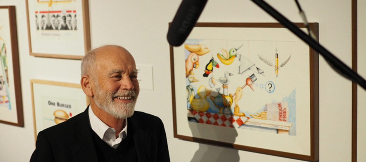
Contextualism shows the idea of the relativity of things. All these inanimate birds, these toys and paper folds and bizarre-looking fake birds are having a look at some French fries over here. A natural bird would be delighted by that, but it has no relevance to these toys. They don’t know what to do with it.
Similarly with Fully Furnished, this budgie has got everything he needs, but he hasn’t a clue because he’s just a bird. What does he need all that stuff for? He’s even got the New York Times to read. That probably started off with a budgie, I’d have thought “it’d be nice to paint a little budgie”. So I painted that, then questioned the idea of this overindulgence, a bit like back there with the “vanitas”. This is sort of the budgie’s vanitas: you don’t need all that to go to budgie heaven.
Not difficult to spot the theme with these six. Were they made around the same time or do they just happen to share a theme?
I will revisit themes a lot, because love is part of the universal consciousness, really. I’ve always been fascinated with unrequited love: through movies, through poetry, through all that stuff – through personal interaction with that and other people’s responses to it. So I can use that with my humour to explore that idea. It’s a hard thing when love is not reciprocated, but it’s also an interesting place to start to lessen it a little bit, by making it a bit more…humorous? I don’t know. To present it in a more humorous fashion, I guess.
In Love’s Little Felony the text says “the abandoned heart was later found in a dumpster,” so this is all stuff out of that dumpster: an empty wallet, a broken heart…
Now there’s a story behind the little letter there, isn’t there.
When I was teaching in Australia, and one of my colleagues…I was doing this picture and I needed feminine handwriting, so I got her to write a letter. But the only thing I wanted was a quarter of the piece of paper, and the words she would write would tell the story, without having to have the whole letter there. So we got this very cheesy-looking paper, and she wrote that and I crumpled it up and then photocopied it. It goes “I cannot go on like this, it’s impossible…we’ll still be friends …do not try to call me…” That goes in there too. It’s crumpled up so obviously the protagonist threw that in the dumpster as well.
And at the other end here, it just never got off the ground.
No. The guy tried to send a letter overseas and got it returned, and that was it, like the old Elvis Presley song. This, A Brief Flirtation, is also a reference to me attempting to go back to the States assuming that I could maybe go back and be an American. So this is also a sort of letter to America. The high heel is red white and blue. This was an idea of wondering whether I could still be an American. Of course I live here now, so obviously that didn’t turn out! A bit like “return to sender”: here we are in the place where I belong.
The Voracious Heart is one about the seedy kind of – not so much “evil” as, well, somebody you don’t want to stand next to at a bus stop
There’s lipstick on the piranha – a little bit of a giveaway there.
And then again one of those “do not cross” police signs; the black widow; the big knife; there’s the white rose or flower being reddened by the red paint or blood from a paintbrush, and a picture of Rimbaud, the French symbolist poet, who was quite a wild boy. So I painted him up, gave him a bit of rouge, and he’s asking you to call him – and of course you’d never want to call Arthur Rimbaud for anything, except maybe to read his poetry, which is brilliant.
So the last two are perhaps the most optimistic?
Yeah, Afternoon Intermezzo is about two lovers meeting, and symbolic things about that: we have the coffee being poured, the two espresso cups. We have a nice brightness to the whole thing; the hot chilli; the violin that seems to be playing over a sheet; hot sauce; two tickets to Milan; the love poems of Pablo Neruda; the back and forth flow of the bow
“How serious should art have to be anyway?” – New Zealand Listener, 1991
That was from a review of a show I had back then. I’d been exhibiting in New Zealand since about 1976. These last two paintings are larger ones, and they involve this idea of language lessons. The idea behind this is that I’m going to do several of these, and it’s a never-ending opportunity for me. This is The French Lesson, so there are all these symbols that are French in nature, and they’re all referenced by what they would be in French. Up there we have BB – which is Bridget Bardot – and FiFi, a French poodle.
The Italian Lesson is called Floundering and it stars a central flounder.
Fish are quite like the can, they’re an element you come back to again and again.
I like fish. If I’m a bit dry for ideas, I will paint a fish and then things will just happen; it’ll spark an idea and then I can continue on – at least with composition, until I can start making a theme for it. There’s all the elements then of a broken heart. We have a composite photograph that I created here of Lord Byron and Lola Montez, the two lovers here. There’s no reason for them to be there except I like them both.
Now these are from earlier.
Yes, these are the earliest pieces. They’re silk-screens that I did mid- to late-1990s, I think. I don’t date any of my stuff. I just invent the closest date that I have to – a curator’s nightmare, I guess! The thing about the silk-screen process is that it lends itself to nice flat imagery. Other than the modulating of watercolours where I can get nice turns and three-dimensionality, this allows me the opportunity to play with the flatness. There are only three here, but I did quite a few of them, and I was using this egg motif, because with three colours and flat you can create the idea of an egg. This one is Eggs Gaugin, a reference to eggs and the South Pacific. Also it’s a reference to anatomy as well – some people pick it up and others don’t.
This Postmodern Postmortem is really an idea about why we complicate things so much. We seem to want to complicate things, to a point where it doesn’t make any sense any more. A lot of people say they can’t even read postmodern criticism – which is unfortunate, they should try. It’s very interesting. But this is kind of a humorous attempt at showing that. The University of Auckland – I believe it was the maths department – bought one of these when it was shown. I liked that they got a giggle out of it.
These are things that I found, all referencing nothing. This tuatara I drew with pencil, then photoshopped it onto the screen and inked it up from there. I kept it black and white, to keep it simple.
The last one, then, is Wall to Wall Carp. If you were reading it, it should be carp-ET, but the vacuum has erased that part of the carpet that has been saturated with very sequenced black and white carp images. I used pointillism and paintbrush on the fish; pointillism to give that very matter of fact look to it. You can, in xerograph, get shades and gradations and stuff, but it’s not cheap. This is the cheapest way I could do them. You can do gradations by using pointillism so that things turn in space without having the actual bleed there.
And you did that manually; that’s not a photocopy effect?
Yeah, I would have poked that with a tiny little ink pen, over and over again
It takes a while?
Well, it does and it doesn’t. I don’t know about how long any of this takes me, because painting is something you do while doing other things as well. I mean you’ve got the pasta sauce cooking, you’re trying to do something else, you’re answering phones, you’re breaking all the time. The actual “on” time for a larger painting would probably be about a day and a half. It takes me a couple of days to finish one, with the interruptions and things.
So that takes us from the beginning of the show to the end of the show!


